
OKAPA
The Project
My core team was initially comprised of 1 dev, 1 EM, and me; the project’s only designer, but would eventually become a revolving door of talent. There were multiple phases of the project with a large pause in the middle during the pandemic. The client wanted it all and we aimed to deliver it (within the reasonable capabilities of technology).
My Role
Lead Designer
Year
2019 & 2022
Duration
1.2 years total
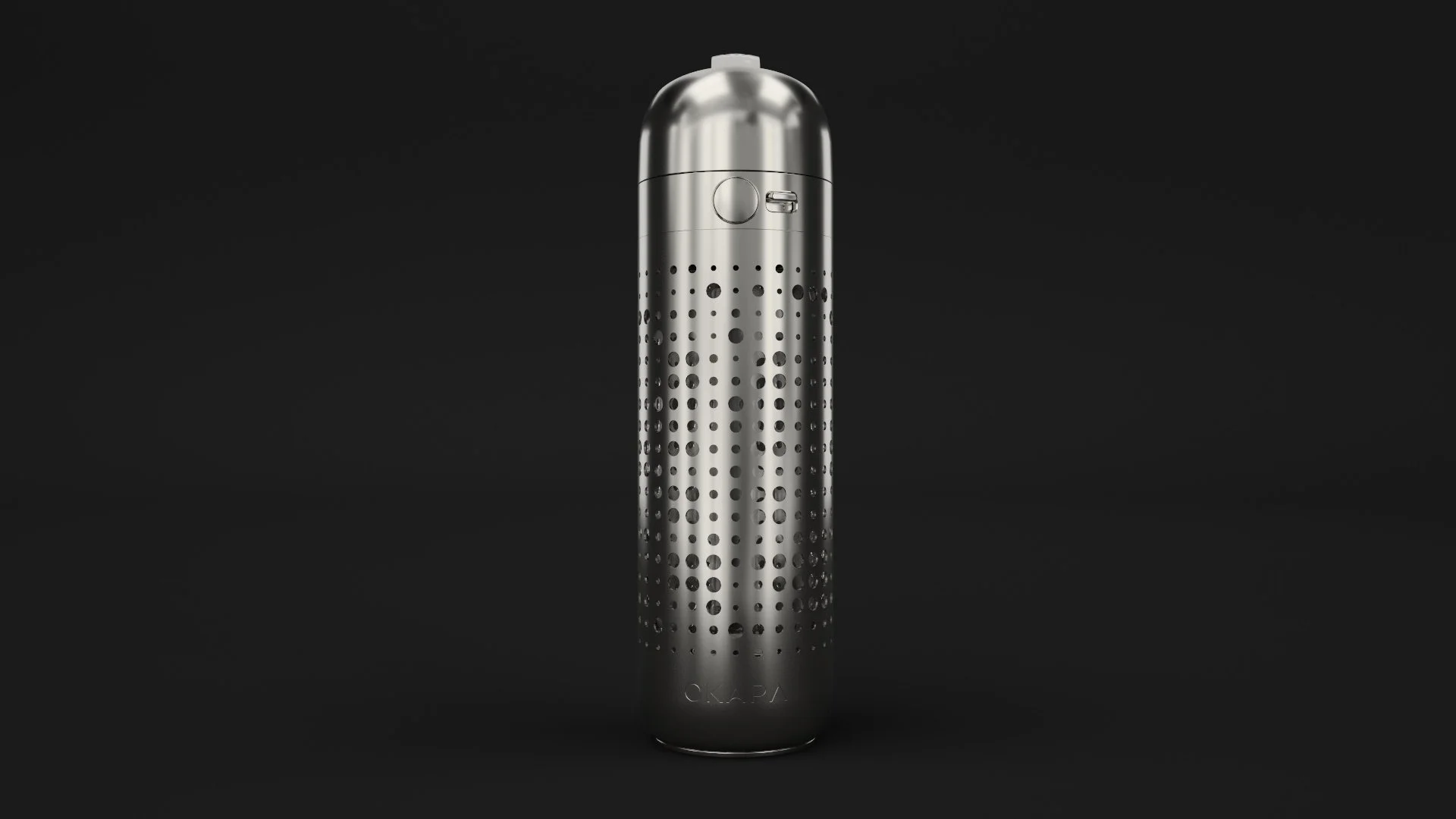
Okapa is a high-end luxury and lifestyle brand about to launch their first product; an expertly engineered hydration device. They favor brand image above much else and were willing to do whatever it takes for their digital brand experience to stand out.
The site is now live, you can view it here:
https://okapa.com/
The Client
Project Goals
To design and build an immersive web experience that introduces the product and brand while delivering core eCommerce criteria.
Make the product look incredible
Educate consumers about product innovations and benefits
Blend product and complimentary character content to give each bottle a unique personality
Give the user a material understanding of the bottle as if they were handling it IRL
Phase 1
Discovery
Discovery tl;dr
Optimizing fidelity of the product with usability and performance were going to be huge
There was alot of pressure to push the envelope of what is possible with technology on the web. This in turn lead us to a few key potential methods for showcasing the product in an immersive and visually impressive way.
Balancing the main page layout with ALL of the expected assets was going to be a big unknown in terms of performance on a wide range of devices
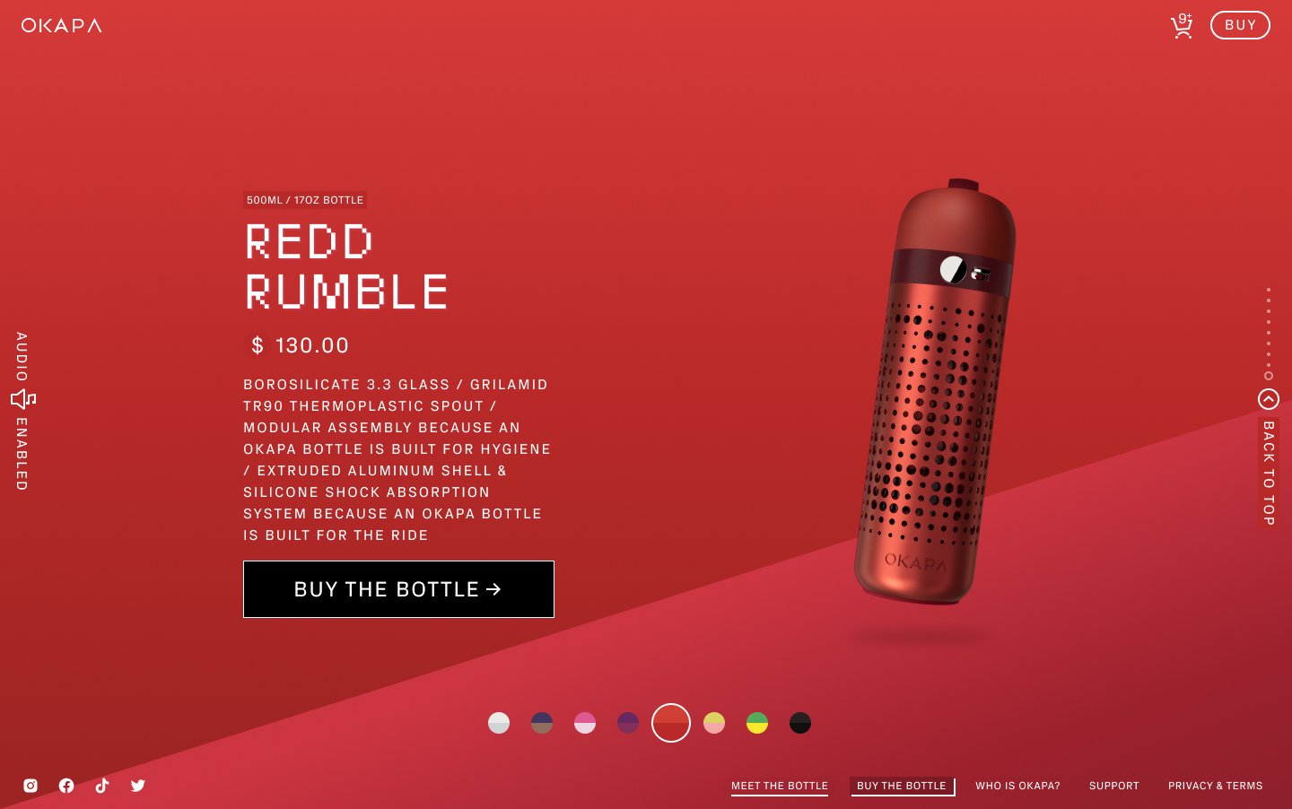
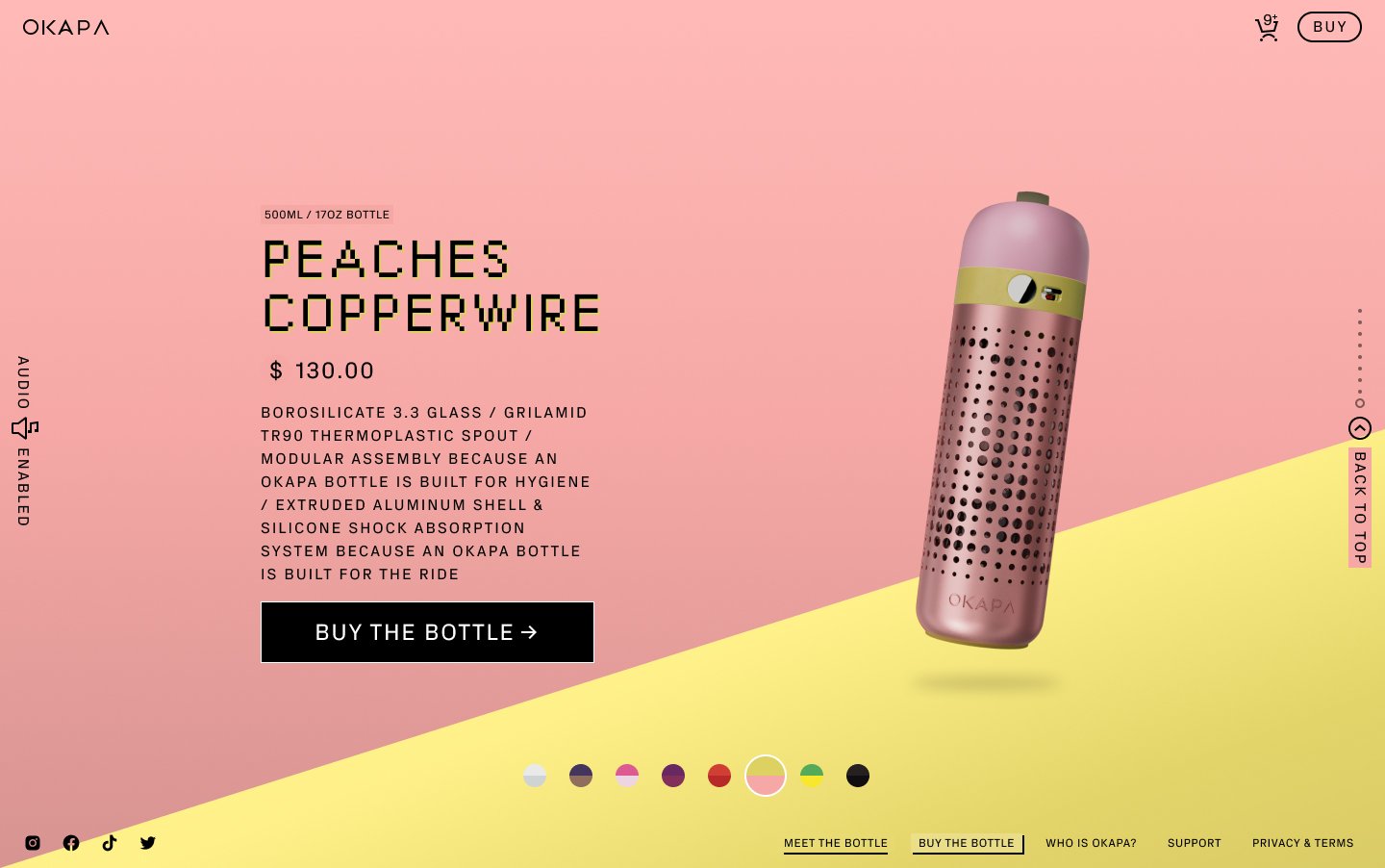
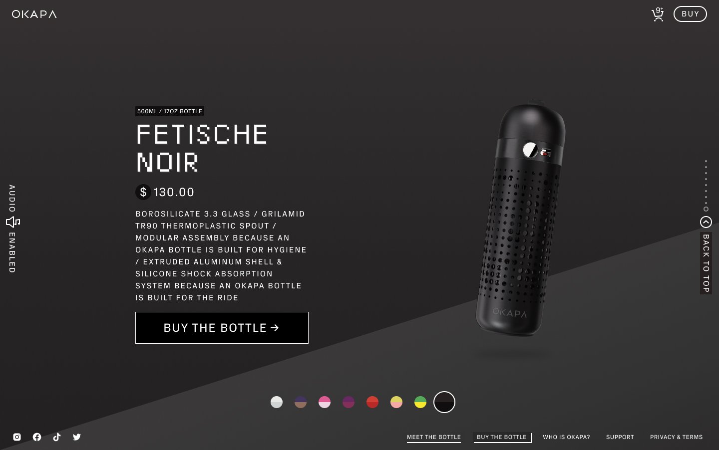
The brief required all 8 bottle colorways to be displayed on one page. Not a huge until you take into account the vast amount of supplementary assets and the potential for an already heavy/taxing bottle asset. The extensive animations were just going to compound this.
Interpreting an impressive, albeit convoluted UX in the original brief would take some careful consideration
The initial website experience was sketched together from a branding agency. We had to take this vision and make it usable while maintaining the integrity of the brand.
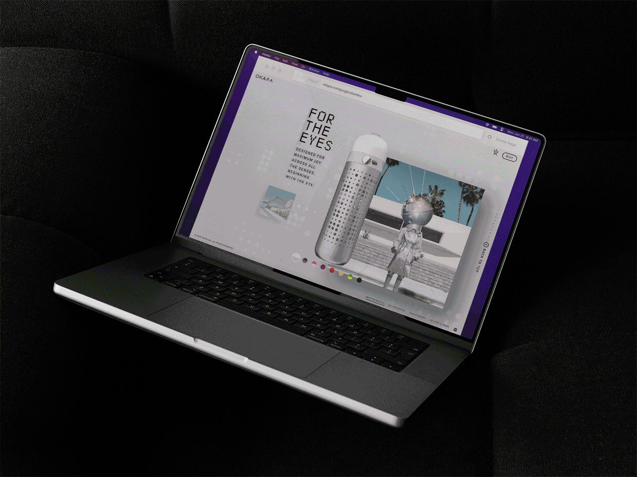
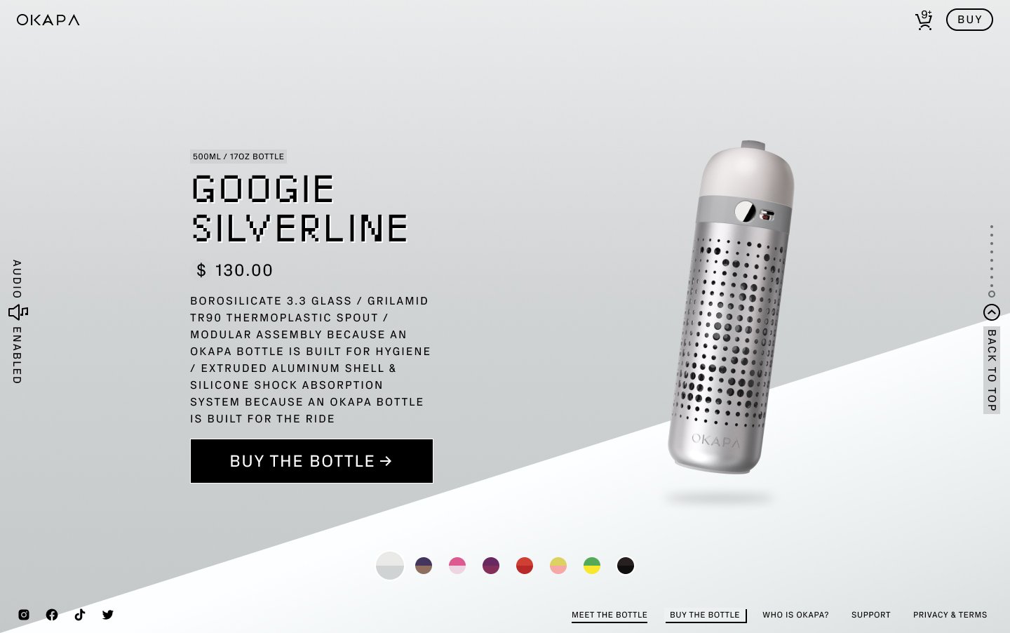
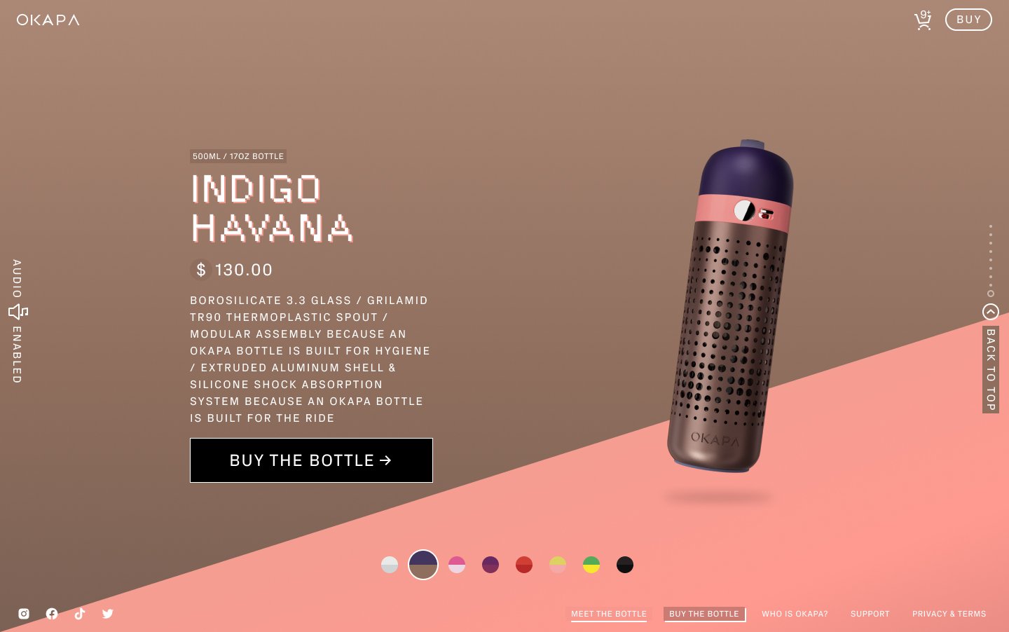
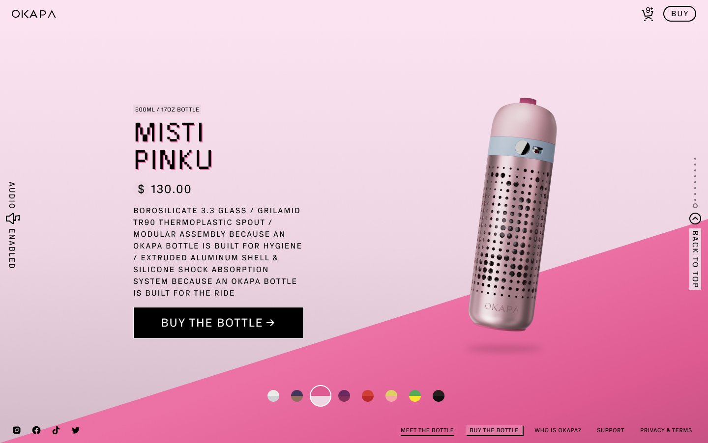
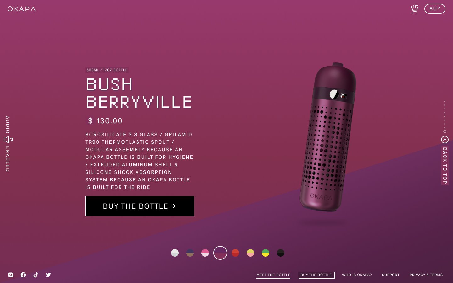
The OKAPA Site Experience

The navigation structure for this eCommerce site would follow a more product feature approach akin to flagship product pages from Apple and others, but with a heavy twist of mystery and intrigue.
Home would be the Product Journey page for now. As the entry into the brand until the client was ready to push the brand experience and launch strategy further.
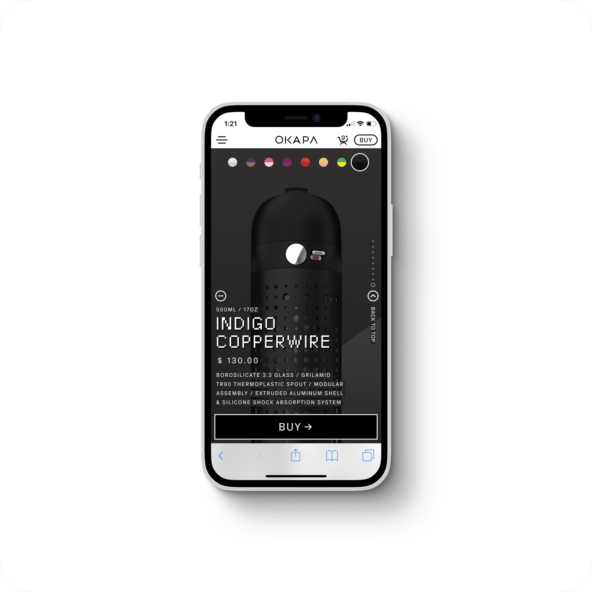
Buy Page was a bit more usual fair, direct approach to finalizing the sale of the product. It would also contain bits of marketing assets when they became available, but on a smaller scale.
About would be a bit of a strange departure from the usual. Here the brand would take a chance exploring obtuse descriptors instead of boilerplate origin stories.
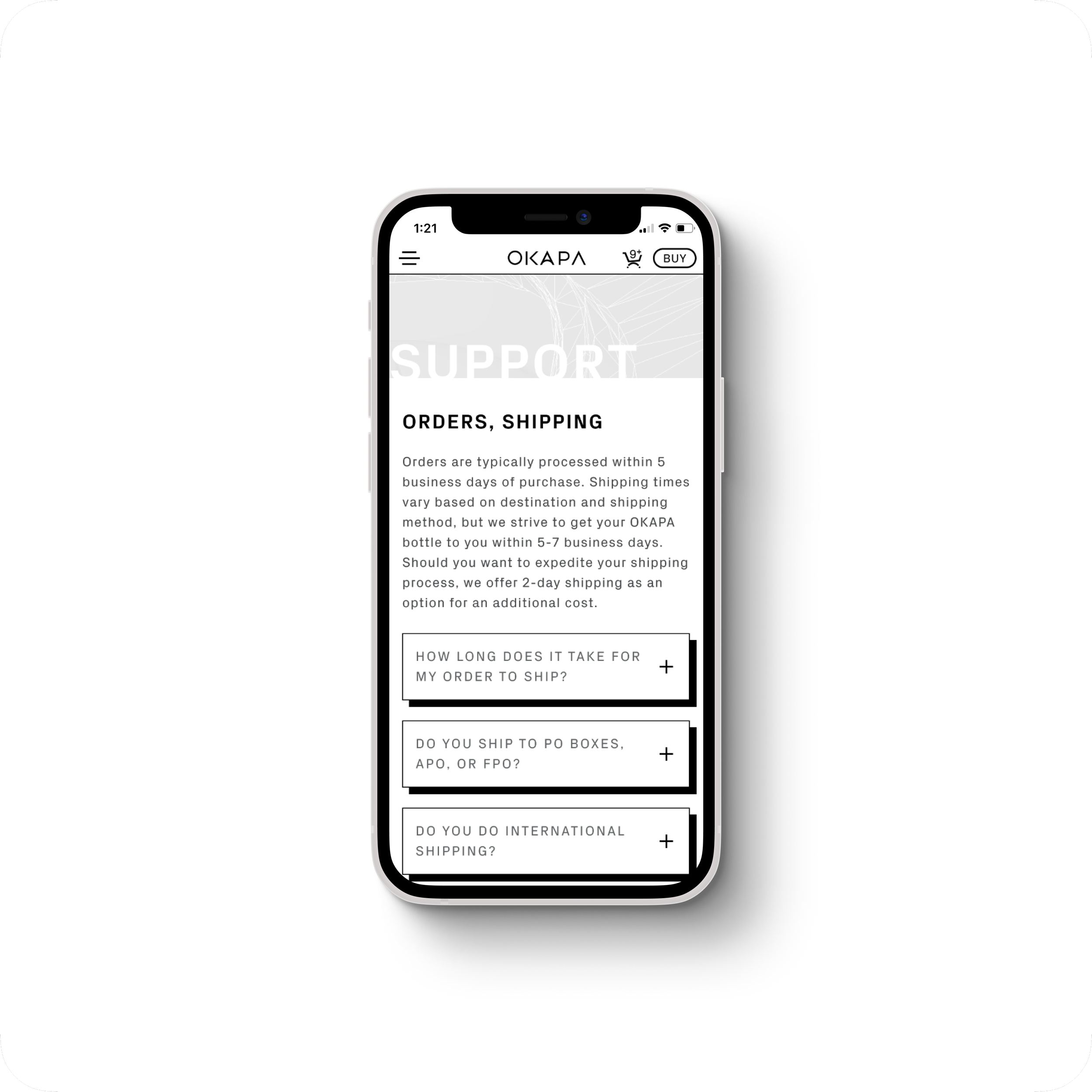
Support & Terms were, for good reason, the most direct and dry to supplement the heavy curtain over most expected eCommerce behaviors.
The Prescribed Product Journey
A brand consultancy had provided an initial site concept to the client. It consisted of a combined vertical & horizontal axial navigation dividing the site into sections; cycling product colorways on a single seamless product animation.
Site navigation concept


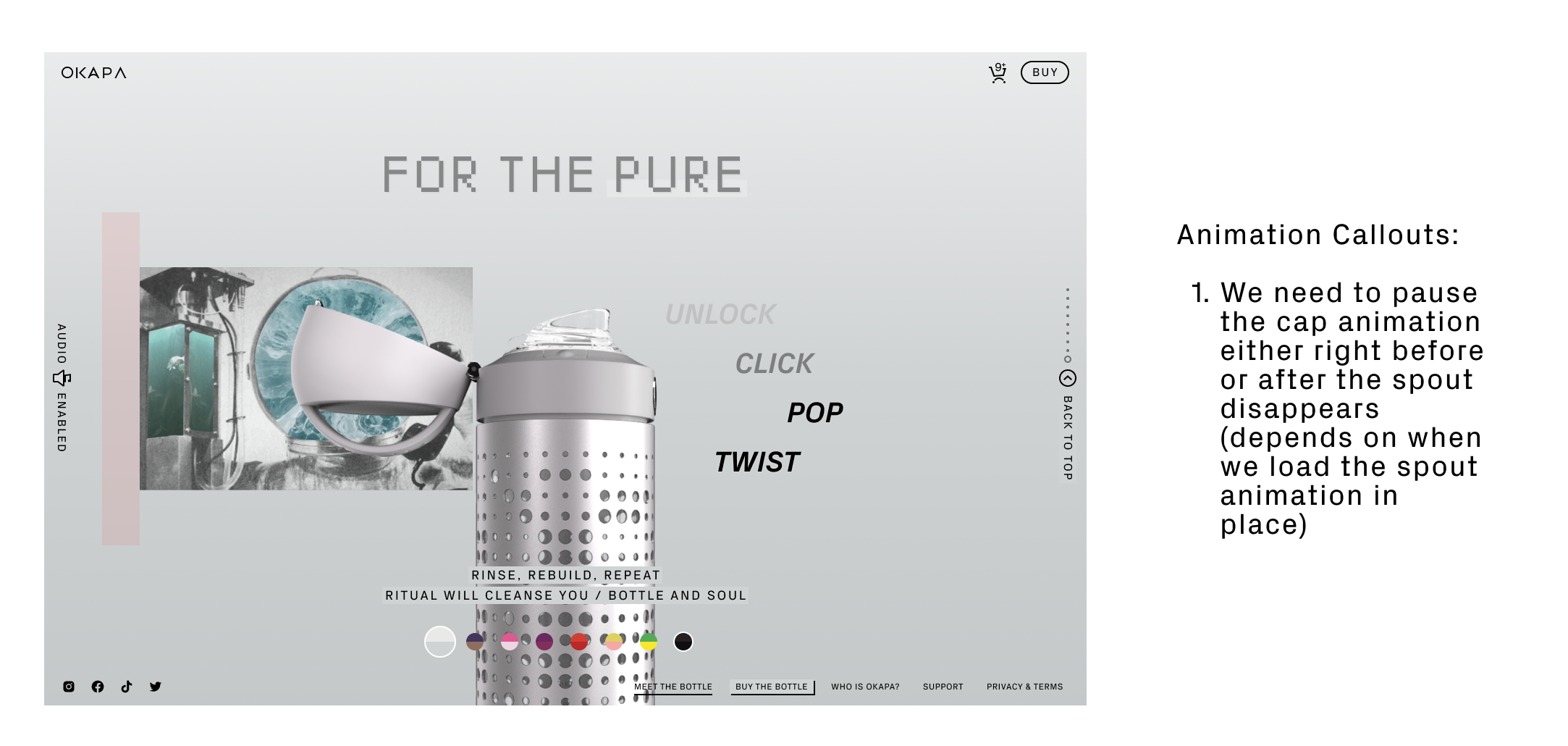
Each section of the product journey would contain a specific bottle animation, text supporting the material features, and unique background art—per bottle color.


From Concept to Implementation Strategy
The bottle needed to strike the right balance of fidelity and performance as well as working with supplemental content.
Video was a contender purely from a simplicity standpoint. We can scrub playback via the site’s scroll, but the options for getting alpha channels to work in the browsers at the time were super limited. Significant rework to the storyboard would be required.
3D WebGL Transparency works well with background elements and it can be highly interactive/immersive. It was however extremely taxing and the fidelity would never match what is possible with pe-rendered assets.
2D PNG This was our recommendation. We were confident we could create an impressive experience thru various pre-rendered image sequences paired with static images and clever CSS animations / transforms. It did however require a bit rework to the existing storyboard.
Tech Implentation Examples ~
Tech Implentation Examples ~
Alpha Transparency Video
Positives:
High resolution, beautiful render quality and motion
Medium initial page load
Relatively straightforward to implement (with major caveats)
Negatives:
Load times for each bottle color could make switching between character worlds a frustrating experience.
Partially opaque transparencies eg. glass and translucent plastic, could produce issues when layered with complex background objects in the current Okapa product journey.
Very little browser support at the time for alpha channeled web video codecs (webm).
Visual explanation of how alpha transparency in video works
3d WebGL
Positives:
Can layer above complex backgrounds
Highly interactive
Theoretically can enable more rapid horizontal navigation between characters
Requires least compromise of site ambition or current product journey
Negatives:
High initial page-load time and CPU-intensive on older machines so will require us to balance useable file size with render fidelity for best experience, ie. photorealistic may not be possible.
The 3d experience is the most taxing option for current technology.
Browser rendered 3d eCommerce experience example
2d Images, Sequences, & CSS Transforms
Positives:
Relatively lightweight when compared to other options
Highest possible resolution & fidelity
Transparencies work well with overlaying background objects
Negatives:
2D animations are simplistic (up-down, left-right) - complex 3-dimensional effects are difficult to fake.
Using images means we would have to considerably remaster the product journey & reset ambitions for site navigation.
Many of the best immersive site experiences utilize pre-rendered images
To minimize the potential overhead of a fully 3d product experience, we leaned into two potential methods for realizing the goal of the main product journey:
Minimal 3d + PNG Sandwich
Since we recognized the client’s desire for standing out, we presented a strategy for navigating thru the product journey sections primarily via pre-rendered images and sequences. With a central area dedicated to exploring the bottle in greater detail via browser rendered 3d WebGL. The 3d usage in this strategy would be significantly less taxing by removing the lengthy bottle animations from the 3d flow.

Fully Pre-Rendered PNG Journey
A second more conservative approach would utilize strictly pre-rendered assets on the main product journey page. We kept the option open for exploring browser rendered 3d content on the buy page, but this strategy was about proven methods for displaying rich content. The product journey would utilize a combination of PNG sequences, GSAP Javascript animations, CSS transitions/transforms, and other pre-rendered rasterized content.

The Direction: 3d WebGL
We lead with our recommendation of pre-rendered 2D imagery, but ultimately the client was not ready to undergo a redesign on the main product journey — A decision that would come back to haunt us later.

Phase 2
Design & Build
Bottle Choreography
We had gone thru a few bottle storyboards showcasing how it should move thru its environment. However, now it was time to flesh out these movements in detail in order to adapt the vision to work on the web. Weeks of sketching, revising, mocking up sample sections all to clear concepts and prepare for onboarding our 3d Designer to the team.
A Dancer on the Stage
After many client meetings and revisions to the storyboard, we settled on what would one of many bottle animation cycles. I worked with our 3d Designer closely to direct what timing and feeling we needed to convey at every stage of the product journey. This is but one test render combining a snippet of bottle movements with background animations. These animation tests in After Effects were crucial in translating to the web experience.
Creating 8 Unique Character Worlds
With much of the bottle movements squared away, I could now associate each bottle color with their individual background art. This pairing would comprise each character world. The original concept needed much work to map out how, when, and where we could animate background art in conjunction with the bottle without detracting from the experience.
Motion Forward
I cannot stress the metric boat load of iterations, mock-ups, after-effects animation tests, and layout explorations I created during this time. With so much motion expected on the site, each section needed special attention. These visual samples were just one way to bring the client into the process early and explore / vet the possibilities before committing them.
Creating the Full eCommerce Experience
With the main product journey experience approved and documented for dev implentation, I could shift my focus on the supplementary pages such as the product buy, support, and about pages.
-
![]()
Buy Page
-
![]()
End of Journey CTA
-
![]()
Support Page
-
![]()
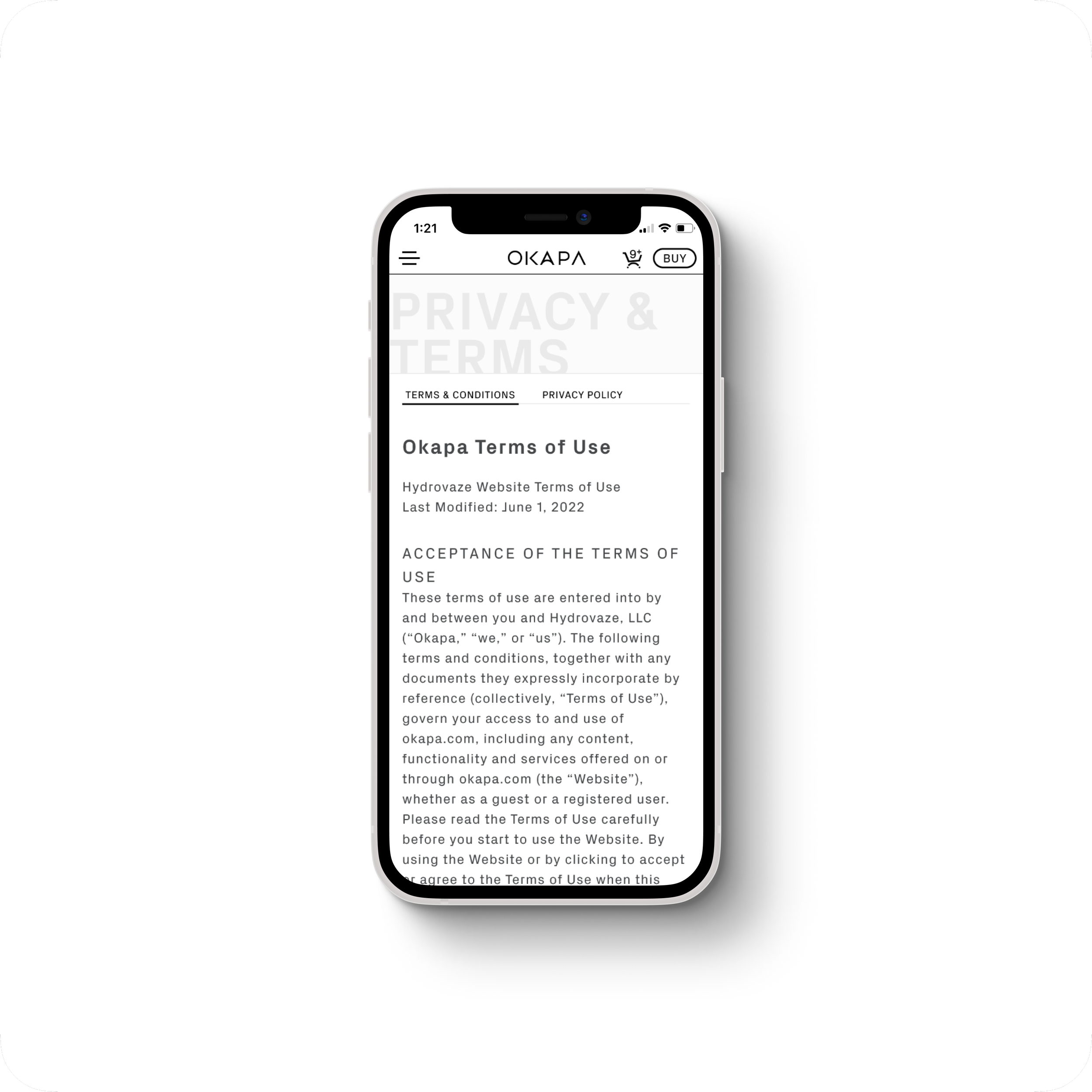
Privacy & Terms
-
![]()
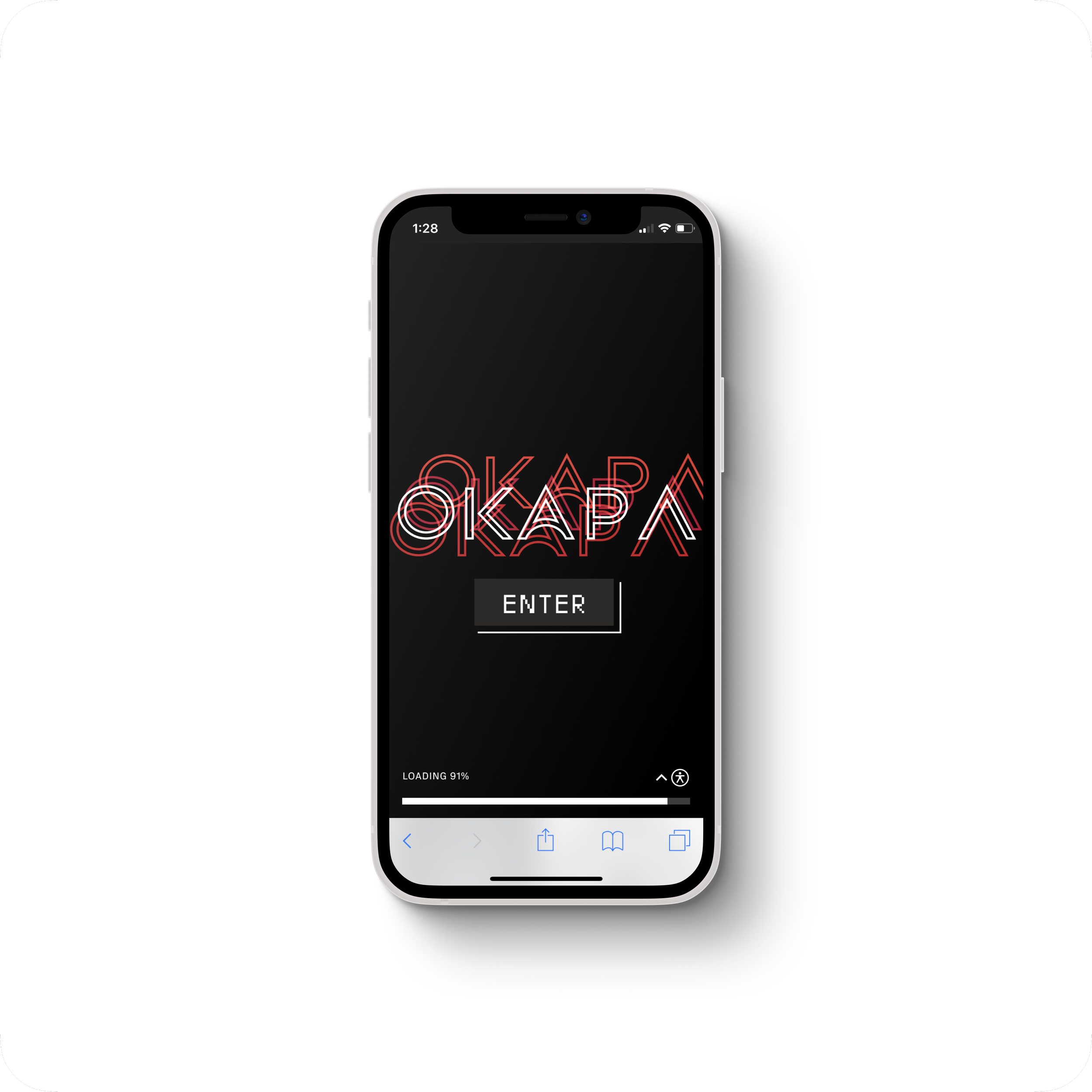
Landing / Loading
-
![]()
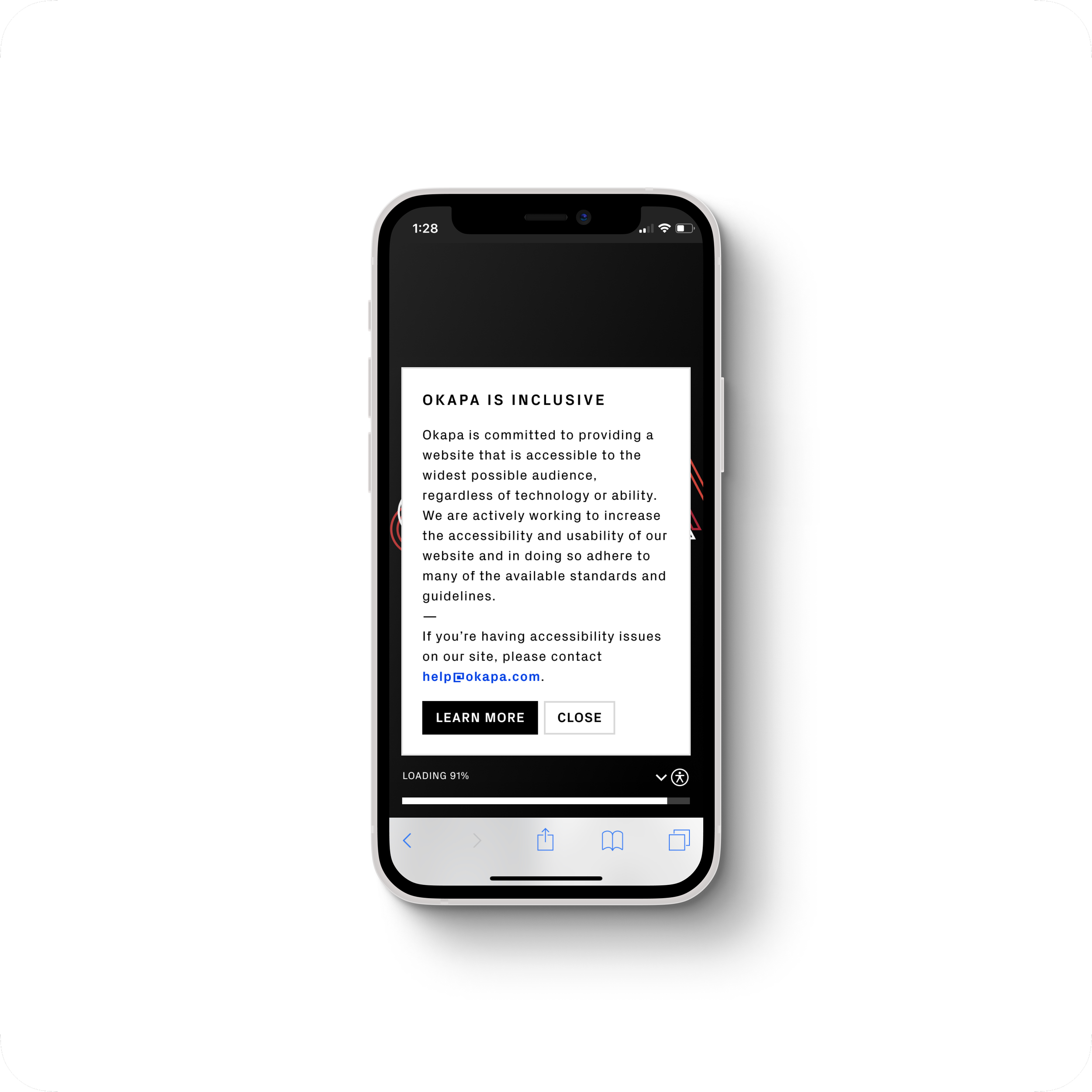
Accessiblity Statement

Supplemental Pages & Extenuating Circumstances
Progress on the site was interrupted in 2019 by sanctions then a pandemic. Focus was shifted near the end of the first engagement to button up as much of the site’s secondary pages so the client was left with a fully navigable experience to show investors during the pause. We resumed work in the summer of 2022 understanding that there was much fit and finish that remained.
Phase 3
Enhance Fidelity
Product Fidelity on a Deficit
Using 3d meant we had very little headroom for additional improvements like expensive lighting effects and individual audio for each bottle color. The more the client wanted to add, the more the end user experience started to suffer. Our only solution was to redesign the product journey to utilize standardized raster image content; much like what we recommended during discovery.

Then vs. Now
Fully 3d Product Journey
Pros:
Smooth and seamless movement from section to section
Unexpected/novel use of 3d helped the product stand out
Cons:
Poor performance on older devices with inconsistent performance on new devices
Threshold for fidelity improvement & asset additions very low
2d Image Sequence Product Journey
Pros:
Far better performance on a wider range of devices.
Much higher visual fidelity of the product
Cons:
2d movements aren’t as immersive as the 3d choreography
Pre rendered image sequences must be kept short to ensure adequate device performance
Wait, What’s an Image Sequence?
Image sequences can behave similar to video, but with transparency support for layering above other objects. The method we used essentially plays back several individual .webp files in a container that is z-indexed above other content. This meant we could load short snippets of faux-3d movement with all the visual enhancements of pre-rendered content without the massive overhead of in-browser rendered 3d content.
Animation Annotations
Documenting the animations became a priority when project hours were reduced. This enabled the devs to answer most of their questions autonomously. Any additional context I provided during deploy reviews.


Finalizing the End of Journey Page
Reconfiguring the CTA that was our end of journey page to work with the new assets was a small, but necessary lift. Minor changes were made to support the journey animation code and improvements made to the layout hierarchy.

Bringing it all together
As I rolled off the project, the team continued to put together all the latest updates. I was able to pop in from time to time to review, direct, and consult. While my time was limited towards the end, we made the best of it and delivered a site that was leaps and bounds more stable than before and improved visuals every step of the way.
Takeaways
Users!
There was truly a minimal amount of user-testing we could squeeze in for this project. It’s not for a lack of trying, but we were simply not successful in convincing the client to allow us to get proper feedback. Because of the strict NDA and fears of copywrite infringement, we had to resort to feedback sessions within our company and those covered under the NDA. This should absolutely change and moving forward, I do hope the client finds value in future feedback.
Project Management
This project had a ton of ups and downs. While we were frequently on the bleeding edge of technology and doing truly novel things without a roadmap, the expenditure was massive. There are many points I have pinpointed throughout our engagements with this client where we should’ve had a re-discovery/mid-project kickoff. Something we did not achieve until much later.
Too Many Cooks
One of the major pitfalls I saw with this project was fighting against the flawed direction of a branding agency who had prescribed much of direction and navigation of the site to the client. I struggled at every junction to advocate for a better user experience and create something that would not impede its purpose: to sell water bottles. Looking back, I feel I was only moderately successful in this.
A Full Design Audit
My time was cut short on this project due to circumstances outside of my control. I hope someday soon, before launch, that the client brings in a designer to fix and document things like bugs, interaction issues, layout crowding, and generally get both the UX and visual design to a standard I was unable to see it to.